One of the most exciting developments in London's underground over the last few years is both the emergence of fledgling label LONG CLOTHING and the re-emergence of classic London label, BOY. The former, with its B&W T-Shirts and hoodies boasting iconic and irreverent geometric graphics, has breathed fresh air into a stale scene. Rather like the latter's effect some generations before. So it's no surprise that the two labels have formed an alliance that has resulted joint collections, designs and now, the launch of the official BOY website.
Recently London's End End has seen the rise of a style I've dubbed 'Modern Noir' which seems to marry the stylings of 1930s/Bauhaus (design) with 1980s/Bauhaus (the band). A key element of this look has been the geometric (and triangle-heavy!) graphics utilised by such labels as LONG.
LONG T Shirt for BOY
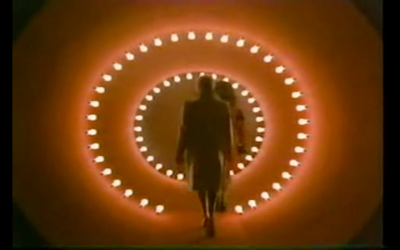
1930s Bauhaus influenced BOY TV advert
Although launching as a Punk label in the 70s, it was in the 1980s that BOY became an international ambassador for cutting edge London style with it's use of bold, often cheekily imperial, graphic imagery. The New Romantic kids had moved on, and along with Ray Petri's Buffalo movement, they embraced a super-fresh look that screamed 'POWER!': playfully toying with brazen sexuality and bold, almost Olympian, imagery...all set to an Acid House & New Beat soundtrack.
Now, having laid low for about a decade, BOY have recently begun their return, operating out of the shop/borderline squat christened 'SICK' in the depths of Redchurch Street, Shoreditch. It was there where I had a long chat with label founder Stephane Raynor. He recounted the early days sparring with Westwood on the King's Road, dressing Spandau Ballet, opening the first boutique in Ibiza, the chaos of the late 80s when every pop star worth their salt literally begged for BOY clothes and the small matter of declining an offer of a very large sum for the label by one Philip Green of Top Shop...
With the distinctive BOY logo once again appearing in ever more pop videos and fashion shoots, it appears that the return of the BOY empire and it's ensuing chaos is now inevitable, about time too!
Fonteyn DJ's at the Official launch of www.leavetheboyalone.com at Cafe De Paris, London, July 29


